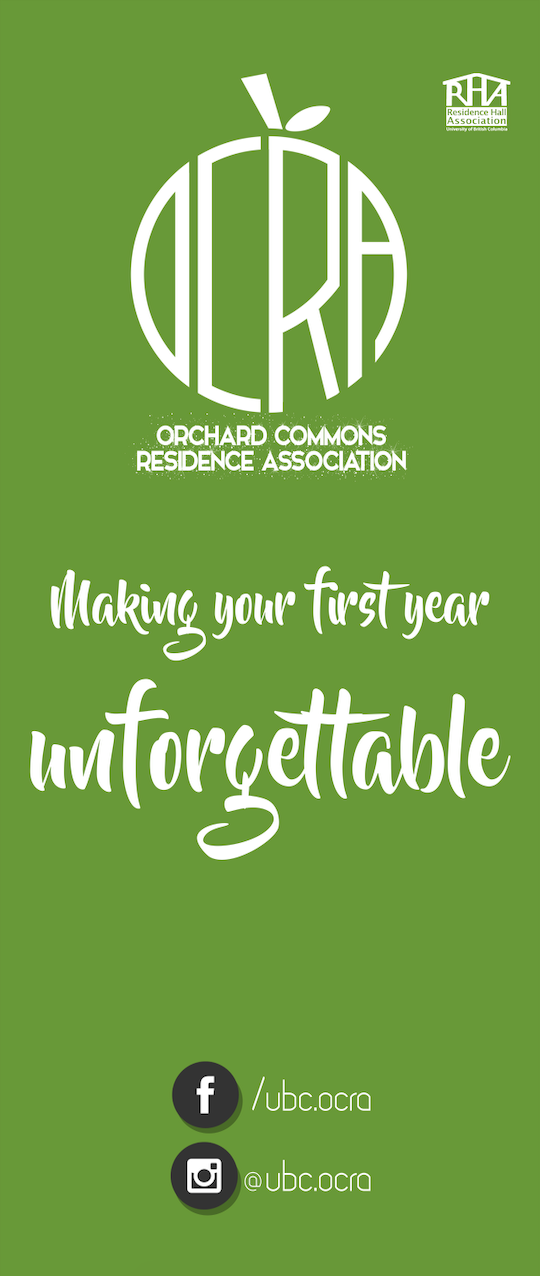
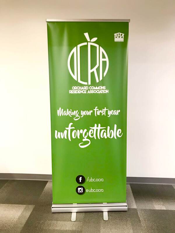
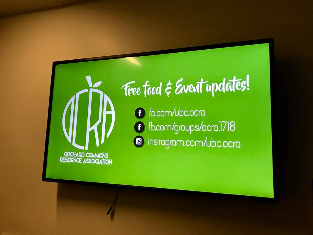
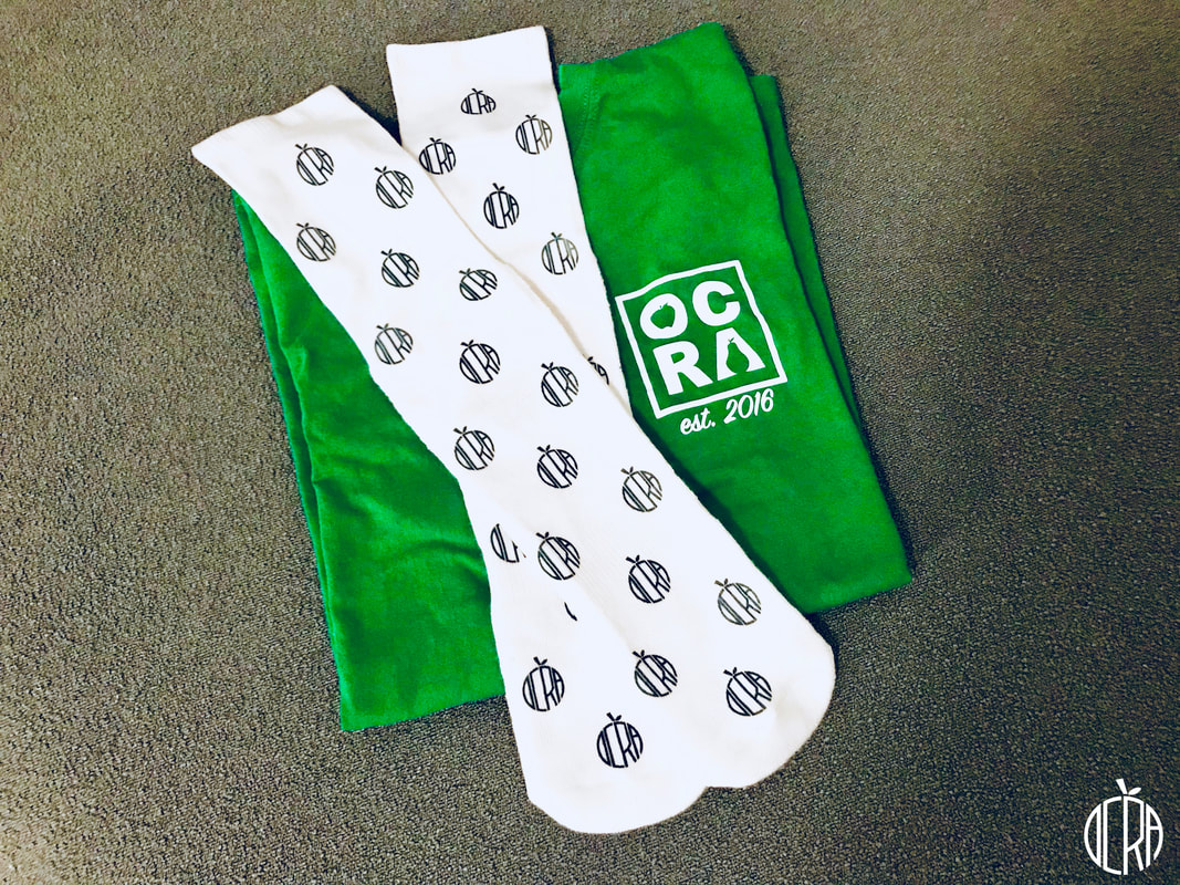
Orchard Commons Re-branding — 2017
|
Pull-up banner, digital signage graphic, print-out photo banner, socks, and apparel for UBC Orchard Commons Residence Association 2017/18. Re-designed logo after organization re-branding.
Logo was inspired by the shape of a fruit, as the residence was named "Orchard Commons", with two buildings named "Bartlett" pear and "Braeburn" apple. |
CLIENT
UBC Orchard Commons Residence Association (OCRA) CREDITS Photography by @leejohnny_ MY ROLE OCRA Marketing Coordinator - Graphic Design with Adobe Photoshop |

|

|

|